Monday, September 29, 2014

Unity Tip : Dense Grass on Really Big Terrains


The challenge of making an open-world city is how very big the map needs to be. There are several ways to do this but I chose to go with about 4 Really Big terrains.
______________________________________________________________

Problem:
Now I can't get my grass close enough together to look realistic

Grass Density 1


Why?
  • Ground cover in Unity terrains is spaced via square terrain units
    • it can only have so many instances of a ground cover per square
  • Every terrain has the same number of square units

Therefore : When you make a very large terrain, your units and thus ground cover get spread out

______________________________________________________________

Solution:
The terrain can be tricked by using multiple types of ground cover, or copies of your favorite
  • Spread your favored grass/bush/flower as thickly as you can
  • Create a second grass/bush/flower and spread it over the same area. Twice as dense!
Grass Density 2


Now just repeat the process until you're satisfied. I like to mix two types and colors of grass for realism, but here's three for the nature enthusiasts.


______________________________________________________________


All blog posts by UnityGirl are inspired by my work with Brunelleschi: Age of Architects on the Aesop Games team. Check out our Crowd Funding page(s)!


Tuesday, September 23, 2014

Draw Pad: Inkscape Sculpts Your Sketches


Finding Inkscape was great enough. It increased the speed and quality of my graphics work significantly. Combining the detail provided by the draw pad with the Sculpting function of Inkscape makes creating almost any image possible.
______________________________________________________________


Inkscape Sculpt Tool
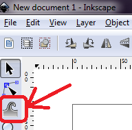
This is a revolutionary tool for free image software. You can find it third from the top of your left vertical toolbar. It looks like a little gray wave/finger
How To Use It
The basic function is very simple. 
Now just grab an edge and pull!
______________________________________________________________

What It Makes Possible
You don't have to have a draw pad to make this tool work for you. Even starting with standard circles and squares, you can make unique shapes with simple mouse control. 

Check out this piece of concept art for Aesop's future Primian Genesis game, all made with the sculpting tool.
______________________________________________________________

Improving Draw Pad Sketches
The sculpt tool, along with Inkscape's intuitive interface, are great for working with draw pad sketches. You can smooth, lengthen, combine, and shape your lines. You can add shading, paint bucket fills, and hand-craft shadows.

For our example, we'll start with quick Draw-Pad sketch. The first sketch was done in about 5 minutes. For the second image, no lines were added or moved and only the sculpt tool (at displayed settings) was used. The edit took about 30 minutes, playing a lot with line shaping options.

Note where it's thickened in some places and thinned in others. Lengthened, smoothed, curved, shortened, joined with other lines or shaped into multiple connected lines as with the neck.
______________________________________________________________


All blog posts by UnityGirl are inspired by my work with Brunelleschi: Age of Architects on the Aesop Games team. Check out our Crowd Funding page(s)!

Sunday, September 21, 2014

Unity Tip: Easy 2D Drag with Touch

This is a quick and incredibly simple way to touch and drag gameobjects in 2D unity space.
______________________________________________________________

The Script!


For Copying

using UnityEngine;
using System.Collections;

public class TouchDrag : MonoBehaviour {

// Update is called once per frame
public float speed = 0.1F;
      void Update() {
            if (Input.touchCount > 0 && Input.GetTouch(0).phase == TouchPhase.Moved) {
                 Vector2 touchDeltaPosition = Input.GetTouch(0).deltaPosition;
                 transform.Translate(touchDeltaPosition.x * speed, touchDeltaPosition.y * speed, 0);
            }
      }
}

     
______________________________________________________________

"Why Post this Tiny Script?"


Simple. A lot of people have asked. Not me personally, but while researching in the forums I found tons of questions about how to drag with touch. Every game has special requirements of its code, but I found a lot of the answers that, while functional, were really complicated. Many didn't have answers at all. Thus, when I discovered that I had a totally simple and functional drag script: Sharing! :D


______________________________________________________________

"How Should I Use It For My Game?"


  • Experiment
    • I suggest testing out the speed variable, I haven't yet
  • Bumpers
    • These will keep your object from flying off the screen at flicking-speeds
    • 2D colliders on object and bumper-object
    • I suggest a 2D Rigidbody set to "is kinematic" on the bumper
  • It's Your Game
    • Do what you want. If it's really cool, blog about it!


______________________________________________________________
"Where did you find it?"
In the documentation. That's right. It's right there. It's the first example under Input.GetTouch. The only problem? It's not labeled at all! I didn't actually even know I had a great touch-drag script until I realized I WAS touch-dragging an old gameobject that still had this TEST script thrown on as a beginner's try at touch!

______________________________________________________________

Serendipity for All! :)

My happy accident is now everybody's happy accident! Let us rejoice and move things around with our fingers!

______________________________________________________________


All blog posts by UnityGirl are inspired by my work with Brunelleschi: Age of Architects on the Aesop Games team. Check out our Crowd Funding page(s)!


Tuesday, September 16, 2014

Inkscape: Faster, Better UI Elements


I'm UnityGirl with a special report on why Inkscape kicks ass for quick UI elements.

______________________________________________________________

It's Free
I'm sure I don't have to stress to the indie community the value of free dev programs. I'm thrilled about another great program I don't have to buy or subscribe to.


It Goes Faster

Whether it's concept art or creating your final polished UI assets, you have a few options.

  • Paint, the Gimp, Paint and the Gimp, Something Not Free, Things on Mac and Linux I don't know about, and Inkscape

Working with Paint, the Gimp, or even both together (my old standby) isn't bad, but Inkscape is faster.

What Makes Inkscape Faster?
  • Intuitive layering of every artistic stroke and shape you make
  • Easy border and transparency settings
  • The sheer number of shape options!
  • Helps re-arrange and alter layers quickly for multiple versions of an image (ex: matching buttons)
______________________________________________________________


It just looks better

With the ease and options of Inkscape, any time you put into polishing your images will show. Here's some personal examples.


This is an example of a loading bar I made mostly in the Gimp. As you can see, it's got a nice metal texture around the edge and a cloth texture in the center. It's rounded at the edges and has a consistent border. On the other hand, it looks flat. It's clearly just two textures stuck together.


Alternately, here's a radial loading dial made in Inkscape. See the simulated dirt? The smooth lines? The mild illusion of depth?

This dial looks better AND was faster and more fun to make than it's bar-shaped older brother. I've found Inkscape a better program for original artwork.


______________________________________________________________


All blog posts by UnityGirl are inspired by my work with Brunelleschi: Age of Architects on the Aesop Games team. Check out our Crowd Funding page(s)!


Sunday, September 14, 2014

Unity Tips: Basic Menu JS


In the earliest steps of both learning Unity and making a game, you're going to want a basic menu. There are tons of ways to make menus beautiful and themed later but this is the basic structure. Again, I'm using JS (Unity Script), as that's what I wrote most of my early scripts in.
______________________________________________________________


Function
  • Place menu on a clickable game-object
  • Creates a 3 option menu in your upper right hand corner 
    • edited-out secondary option for centered menu
  • Fourth button to close menu
  • This particular script changes the game object's material
    • assign the materials in the inspector


Your final result should look like this


_______________________________________________________


_______________________________________________________

Check out the Video for the full process


______________________________________________________________

All blog posts by UnityGirl are inspired by my work with Brunelleschi: Age of Architects on the Aesop Games team. Check out our Crowd Funding page(s)!
Tuesday, September 9, 2014

Unity Tip: More Natural Unity Terrain Texture

______________________________________________________________

Here's a little Unity tidbit I didn't find out about until fairly late in my development process. Fortunately, it's quick and easy to implement.

One of the things you may have noticed is that Unity terrains, though incredibly mold-able, are not very realistic up close. Whatever texture you use, even if you tile it to look right, is still obviously just a picture of grass or rocky dirt. This is because it is completely flat.

What's more, there's a slot for normalmaps in your terrain textures, but they don't do anything! After a bit of googling, I found a trick that isn't mentioned in the Documentation. It turns out that there's a second Shader available for terrains other than plain flat diffuse.
  • Make a new material and assign it the Nature/Terrain/Bumped Specular in the drop-down in the Inspector.
  • Select your Terrain and click the Gear button in your Terrain script in the Inspector
    • Under Base Terrain is a slot for Material. Assign your new Bumped Specular material
Now any textures you add with normal maps will look all bumpy. Downside: now they're really shiny too. 

This looks a lot better texture-wise but you're probably not used to your grass and dirt being this shiny. That's okay. You can turn down the shininess, or if you like, change the shine-color (specular color) in the material's Inspector view.
Here's my new texture with the shininess turned all the way down and the specular color set to black (more like shadow, less like shine). Now your texture doesn't look like a matte painting on a clay ground. Throw some grass on in and a horsey and you've got a lovely field.

There are a lot of less-mentioned and/or completely undocumented tricks already built into Unity. Keep an eye out for more!

______________________________________________________________


All blog posts by UnityGirl are inspired by my work with Brunelleschi: Age of Architects on the Aesop Games team. Check out our Crowd Funding page(s)!

Saturday, September 6, 2014

Cool Trick for Desk Maps in Unity Basic


Many of us Unity developers putting off buying Pro have lamented at the UI limitations of Unity 3D basic. Sure, sure, we've got an entire program just to make game development easy, but we want minimaps! Here's a cool way to use layers to create a static (desk) map that displays a portion your current larger play scene.
______________________________________________________________


The Concept
In Brune, players create cities made up of districts. Cool, how to represent that in 3D? Obviously 3D districts made up of terrain, lots, and buildings to go on the lots. 


Great! I've got a district with lots that build buildings when you click on them.

______________________________________________________________


 Now I Want:
  1. A map of the district players can look at
  2. The map has to show buildings the players just built by running around in the districts
Problem: Still don't want to buy Unity Pro so I don't have Render Texture to simply put  piece of paper on my Desk view that looks represents a current camera view of the district.

Solution: Put a giant desk below the district in question and have a camera look at it from above!
Like So

With and without ability to see other districts and the shared terrain

The final steps make sure players only see a lovely pseudo-mini-map and a candle-free terrain
  • Create 2 custom layers per district/desk setup. 
    • One for the district and all objects players will interact with outside of the map view
      • set all district objects to this layer
    • The other is for map view objects like the desk, candles, and paper
      • set all desk objects to this layer
  • Create a camera that looks at the desk as if you were sitting at it
    • Set it's occlusion culling to only the district and desk layers
      • make sure it CAN'T see the layers that the rest of your terrain/objects are on
______________________________________________________________


How to Use It
When you want a player to switch from first/third person view to viewing the desk, run a script that switches the active or topmost camera such that your desk is visible, and return to player cam when you're done!


______________________________________________________________

Fun fact: When I did this for my very first district, there was no over-terrain so the player could still run off the edge of the map into "Giant Desk Land"!
______________________________________________________________


All blog posts by UnityGirl are inspired by my work with Brunelleschi: Age of Architects on the Aesop Games team. Check out our Crowd Funding page(s)!

Tuesday, September 2, 2014

Why Coherent UI?

UnityGirl here to explain why Brune decided to go with Coherent UI over the other options for Unity3d in-game Web-views. Come sit on the story-telling rug and hear a tale of three little Web Views and a very persistent girl dev.
_______________________________________________________


Brunelleschi: Age of Architects has been a complex fully Web-Page based game for some time. A few months ago I started making the 3D client in Unity. Obviously a great way to encourage immersion is to integrate the web game with the 3D game through playable web views. But how?


Hungry For Porridge
Searching for the right Web View software was very much like being Goldilocks in a mysterious cottage full of disembodied web pages. Choosing the correct one was a matter of trial and error as we discovered what we needed versus what the software offered. I also had to consider my own technical inexperience with web software and consider what was quick and easy to use without learning more programming languages in order to complete the fairly simple goal.

Action Page of the Brune Web Game
What We Needed
Every dev makes choices based on the needs of their game. Since Brune is already a web game, we really wanted to have interactive web views inside the Unity client. That way, the players could play the game while they were playing the game!  (^_^)

Too Hot
U Web Kit - Didn't Hold Session
We started with U Web Kit as the first obvious solution, but it had one major problem: It wouldn't hold a session between scenes. This meant players would have to log into their character -every time- they switched Unity scenes. Uncool.

Too Cold
Awesomium - No in-Game Web Viewing
We then tried Awesomium, which is admittedly great. Good web views and convenient scripting mechanisms AND it holds session between scene changes. However, it also had one vital problem: I couldn't figure out how to make web views in a scene that wasn't dedicated to them. This means we couldn't use Awesomium to simulate game play (ie: access web-character's storage through an interface in the 3D warehouse)

Just Right
Coherent UI - Totally Versatile
Finally, we tried Coherent. Coherent not only holds session and allows you to make web views inside your game scenes, it's support team also answers your questions promptly and thoroughly! This means that even when I run into a hitch with it, I get an answer quick. The devs are quick to help figure out which side the error is on (yours or theirs) and get it fixed.
Coherent UI in Action in our Unity Game


While it's possible your game will need something more conveniently offered by someone else, Coherent UI is a great bet for

  • Web Views that hold session between scenes
  • Web Views inside your game scenes that players can interact with.


______________________________________________________________

Thanks for reading! Let me know if there's something you're curious about, otherwise I'll keep picking techniques and tips at semi-random. Comment or find me on Twitter at @AesopRebecca.
Official Hours: 4pm - 12am PST
Unofficial Hours: 4pm - 5am PST

All blog posts by UnityGirl are inspired by my work with Brunelleschi: Age of Architects on the Aesop Games team. Check out our Crowd Funding page(s)!